
This paper will describe how to use low cost components to gain actionable information and save money on commercial electric demand rates. Case study examples are provided from projects in Colorado.
Understanding electrical load profiles and demand rates
Utilities typically apply demand rates to commercial customers. Under such rates businesses are billed for their demand (kW peak power on a specified interval), energy (kWh), and fixed charges for service. For most businesses, the demand charge is over 60% of total costs, energy charges comprise most of the remaining costs, and fixed charges are comparatively small.
Utilities use demand rate structures as a price signal to reduce overall system costs. Intermittently high power demand must be match with more power plants, transmission lines, and distribution infrastructure than would be required to deliver the same amount of energy with less variability in demand. Demand response, Time of Use rates, and interruptible rates address the same need.
Figure 1: A utility’s costs due to high power demand (both curves represent the same amount of energy).
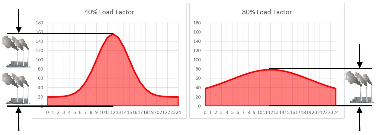
Figure 1: A utility’s costs due to high power demand (both curves represent the same amount of energy).
Height of curve = power (kW), Area under curve = energy (kWh)
Daily “Load Factor” is the ratio of average power to peak power
Load Factor % = Energy kWh / (Demand kW*days*24hr/day)
Demand rate charges are usually based on highest demand over the month and this relates to a monthly load factor.
Grid generation must be constantly and instantaneously matched to demand
The load curves in
Figure 1 represent the same amount of energy, but the one on the left hits a peak power twice that of the one on the right. The utility would need to build twice as much capacity to serve the load on the left and that is expensive.
Why monthly utility bills aren’t very informative or actionable
Given the intent of utilities to send demand price signals, it is unfortunate that many of their customers don’t have the tools or internal expertise to respond. Demand charges on utility bills are like photo radar tickets that companies get as much as a month after the event that set the majority of their bill, and these bills typically lack information about the timing of that event, let alone help a customer identify the source of their peak electrical demand.
Demand rate electricity customers need to understand their power use by the minute to optimize for minimizing demand charges. Such high resolution data also gives them the insight to reduce total energy consumption and monitor the proper operation of their buildings and processes. It’s good to have a sanity check on both utility bills and building automation systems.
Collecting interval data is much easier and more accurate that modeling electrical loads and the options for doing so have never been cheaper. Smart meters are becoming more common and some utilities even provide that data as an added service. However, when comparing costs and benefits, customer-owned real-time monitoring has distinct advantages. Pairing Magnelab current transformers (CTs) with a subscription-free eGauge monitor has proven to be a highly cost effective and productive solution in many Colorado school districts and businesses.
Figure 2: The costs and benefits of various electrical usage data sources.
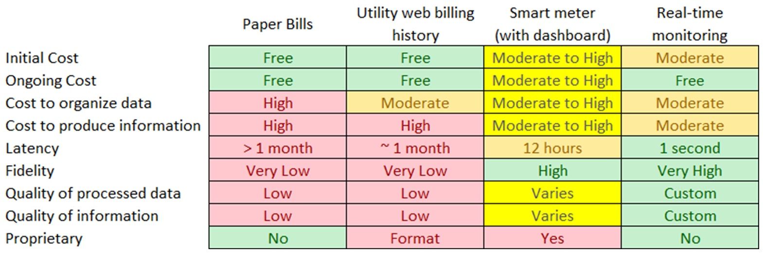
Figure 2: The costs and benefits of various electrical usage data sources.
Various Energy Management Portfolios
School Districts across Colorado
Since 2007 Magnelab and eGauge systems have supported the Center for ReSource Conservation’s ReNew Our Schools program. That program organizes groups of between 9 and 15 schools into one month energy conservation competitions and provides real-time monitoring for the students to receive feedback on the impact of their behavior. District energy managers then go on to use those devices for feedback on their Building Automation System programming, operational procedures, scheduling, and fault diagnostics. This program has been run in 5 school districts that comprise 23% of the Colorado public school population. The first three districts expanded energy monitoring district-wide, the fourth has begun that process, and the fifth has just finished their first competition and are making plans to expand their monitoring.
All of these school district managers have seen the value of this data for their strategic management, they have also been impressed with the amount of influence that building occupants can have if they are provided with actionable information.
Boulder County
The Boulder County government chose to use this monitoring system to collect electrical data for their Boulder County Energy Impact Offset Fund (BCEIOF) because they saw this as a less costly option than collecting and certify utility billing data via bureaucratic waivers. These monitors have the added benefit of helping companies within that program understand their loads and reduce costs.
Fort Collins Utilities
Fort Colling Utilities includes a municipal electric distribution utility with smart meters full access across that data set, but they have also installed Magnelab-eGauge systems to provide higher resolution real-time data for circuit-level building energy system and electric vehicle charging studies.
Inexpensive whole-building demand installation
Figure 2 lists initial costs for these installations as moderate. That is in comparison to the free, but low value-added data customers often get from their utilities. School peak loads vary from under 100 kW in small elementary schools to over 1 MW in some of the largest regional high schools. All of these facilities can be instrumented for less than $1,000 in hardware costs (retail) and minimal labor costs.
QTY 3: $125 Magnelab 6″ Rope CTs
QTY 1: $494 EG3000 Ethernet eGauge
Ethernet cable
Reference voltage and ground wires
Conduit
Electrical enclosure
Spare breaker or fuse block.
Magnelab’s rope CTs simplify installation around feeder room bus bars and have leads that pair with up to 12 CT connections for a single eGauge. Smaller split-core CTs can be used to monitor on site solar generation or specific building circuit loads, like chillers. Four solid wires are used to pick up 120V or 280V reference building supply voltages from each phase of power and neutral. The eGauge unit is also powered from those wires. This model eGauge has built-in Ethernet for connection to the building LAN.

Figure 3: Typical whole-building monitoring installation with green Magnelab 6″ CTs around feeder bus bars on left and eGauge inside its dedicated electical enclosure on right.
The eGauge monitor is then self-hosted, internet visible, and subscription free. It has user-specific access controls and is a passive, secure display of building energy use. There devices are highly robust solid state computers with non-volatile memory. They self-host their web interface and store the latest 10 minutes of 1-second data, 1 year of 1 minute data, and up to 30 years of 15 minute data.
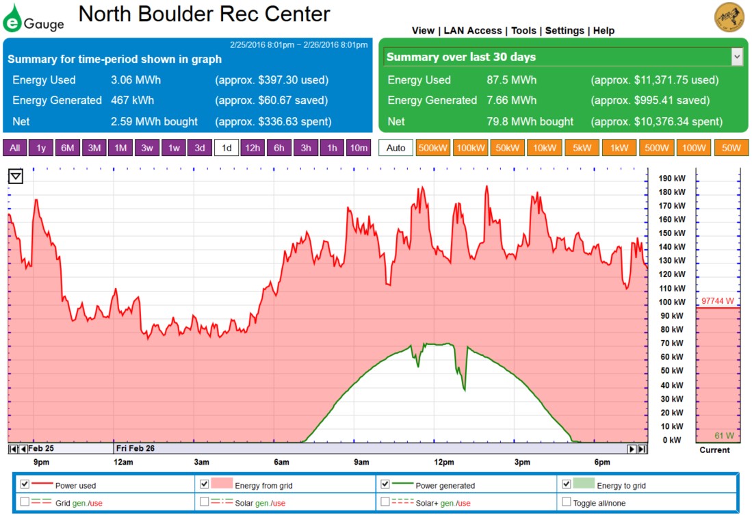
Figure 4: The self-hosted eGauge web interface.
Analysis
Numbers are data, but information is actionable. The ready rendering of power into a load profiles and total energy data summaries is immediately useful. Moreover, eGauge has an application programming interface that allows both URI based queries that return XML results and HTTP POST push data options. This allows user-customized processing of data for portfolio management, alerts, analysis, commissioning, and measurement & verification.
What does a load profile reveal about a building?
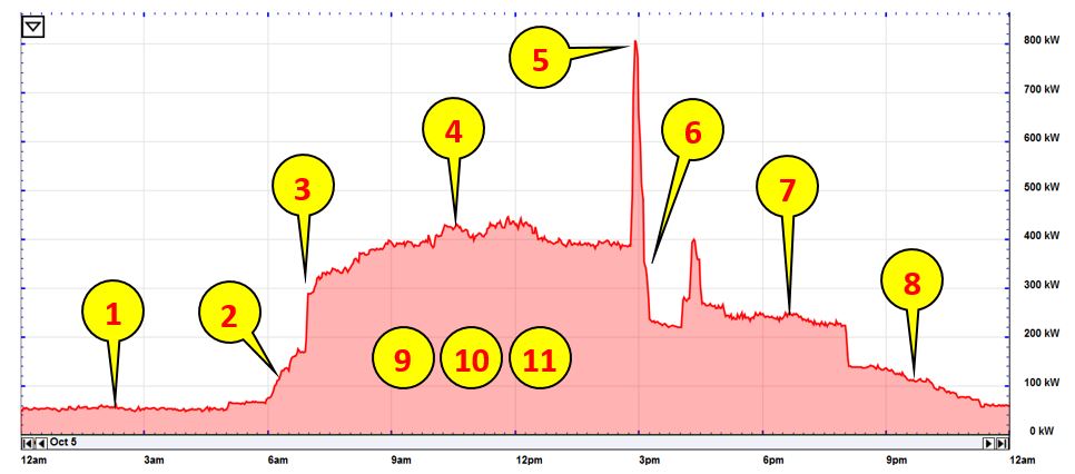
Figure 5: October 5th Load Profile for a public high school in Colorado.
- Can the overnight load or base load be reduced?
- Is the morning startup rapid, efficient, and optimized to the building mechanical systems?
- Is the beginning of the operational schedule well aligned to occupancy, or has it drifted over time?
- What loads comprise the majority of the energy under this curve and can they be reduced via:
- Optimizing delivered energy services vs. specified environmental requirements
- Refining environmental parameters
- Energy efficiency retrofit of major systems
- Behavioral programs
- Does this chiller activation right before the end of daily occupancy have a benefit in line with its cost under demand rates?
- Is the end of the operational schedule well aligned to occupancy, or has it drifted over time?
- Are energy services optimized relative to evening activities?
- Is the evening shut-down and return to overnight load rapid?
- Is the load factor good or improving?
- Is the building schedule being adjusted for holidays and other closures?
- How does this building compare to buildings of similar design and vintage in the portfolio?
1) An Expensive Override
The high baseload of this elementary school led a technician to discover that the air handlers had been set in a permanent override. For how long he did not know.
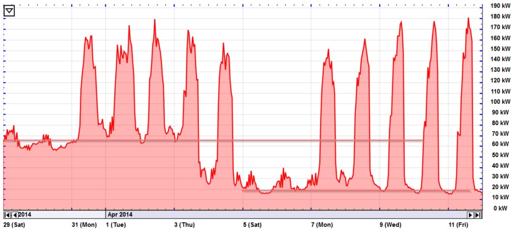
Figure 6: Baseload reduction evident in eGague interface.
Per the superimposed load curves from days with similar temperatures in
Figure 7, removing that override dropped the school’s night time consumption by 751 kWh for savings of $31 per day. Left undetected, costs would have accrued at $11,349 per year. Arguably, as much as 1,085 kWh/day could have been attributed to that override (as opposed to normal cycling. That would equate to a savings of $45 per day or $16,386 per year, but there was a conservation competition running at this same time.
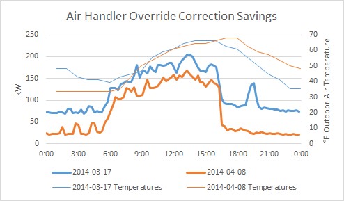
Figure 7: Superimposition of load curves showing total energy reduction from correction of air handler override.
2&3) Improving a Building Start
In another conservation competition, this small elementary school saw in there monitor data that their building startup was well before occupancy and the beginning of classes. They asked the district programmer to correct that schedule creep, thereby dropping their consumption by 85 kWh per day. Over 180 school days that saved $656 per year.
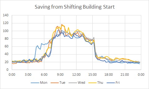
Figure 8: Superimposition of weekday load curves showing elementary school schedule shift.
4) Lighting Reductions, Plug Loads, and Behavior
A middle school in that same district became very active in the conservation competition. The organizing teachers worked with their students and facility manager to reduce lighting levels in excess of the district specifications, remove unnecessary standby loads, and reduce after hours consumption. The result has been a perineal reduction of regular weekday energy use of 14% on a weather normalized basis. That’s an annual savings of 55,045 kWh and $2,278. Reductions over weekends and breaks would substantially add to that number, but extracurricular use of the building is variable.
The comparable weather normalization plots in
Figure 9 of kWh vs. average daily temperatures make this effect quite apparent (all weekends, breaks, and shortened days removed). The black data points for 2013 are insufficient for a fully valid regression, but there is a clear pattern in moderate to high temperatures, and occasional, weather-independent high usage toward low temperatures. In 2014 there are sufficient data points for a full regression. There is still sporadic high usage that is not weather driven. The teachers and their student conservation group were becoming quite active. By 2015 the substantial shift was apparent in their weather normalized usage and it was occurring year round. That school now has one of the lower electrical square foot intensities overall and on a base load basis. That’s despite being of an older vintage.

Figure 9: Middle school weather normalization regressions over 3 separate years.
Lighting reductions and some behavioral contributions are also apparent when superimposing the load curves of days with similar temperatures in 2014 and 2016.
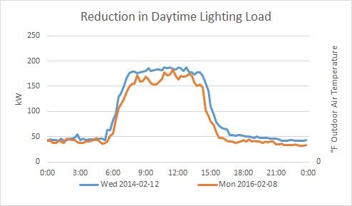
Figure 10: Superimposed electrical load curves showing both total energy and peak power improvements over time.
5) Demand spikes
This high school has been experiencing chiller demand spikes of as much as 200 kW outside of cooling season and at the end of classes on unseasonably warm days. Seeing this effect has led to adminstratiive discussions about seasonal cooling lock-outs, or at least end of day Building Automation System holds so that chilled water is not produced right before the final bell. Those are energy services that no one would feel. A 15 minute 200kW power draw increases the month’s demand charge by $3,200.
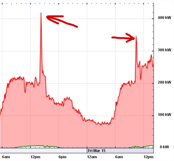
Figure 11: High school chiller power demand spike.
6) End of daytime schedule
Discipline in verifying the end of daytime scheduling hold similar potential to start of day rigor.
7) Evening Usage
Evening usage can often be uniformed. In this middle school the facility manager immediately stopped his practice of invoking occupancy overrides as he worked in the evenings. The monitor data showed that was saving on average 196 kWh per night, which works out to $1,457 in energy charges over the course of 180 school days per year.
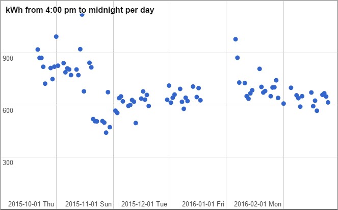
Figure 12: Middle school evening load improvement over time.
8) Monitor Verified Shutdowns
Some facility managers in these districts are now planning to use their energy monitors to verify that they have reach full system shutdowns before engaging security on their buildings. The energy managers will be working to make this the norm.
9) Load Factor Optimization
The Boulder County Energy Impact Offset Fund (BCEIOF) has worked to provide high resolution energy data to a group of Boulder County businesses. These are electricity intensive continuous operations that are process-driven. This data is allowing them to tailor their operations levelized their load curves, take best advantage of daily temperature cycles, and to improve mechanical system efficiencies based on real-time measurement & verification of their changes.
The combination of demand and energy charges are a non-linear effect in relation to load factors, as illustrated in
Figure 13. As the ratio of monthly peak load to average load degrades, the effective cost per kWh increases exponentially (total bill / kWh). The best in class facility in this study has exceed 80% load factors. That has put their effective rate below $0.095/kWh, which is 23% below the worst performer. $0.029 might not appear substantial, but in a facility that consumes almost 2 million kWh per year, that’s an annual savings of over $50,000.
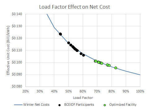
Figure 13: The effect of load factor on effective $/kWh costs.
10) Portfolio Comparisons
Application-level access to monitoring data also allows portfolio energy managers to organize their metrics in real time comparisons.
Base load intensities
In Figure 14 a school district energy manager can see on a nightly basis which schools have the highest intensity base loads. As exemplified by the first case study in this paper, a disproportionately high base load is a clear indication of a mechanical system malfunction and should be investigated. The manager can also see the highest overall annual electrical intensities, which are the driving component of the Energy Use Intensity (EUI) metrics that compare school efficiency across the state. Given the ability to customize the segmentation of their interval data, add school attributes (type, area, population), and filter for comparable energy use, the district manager can readily prioritize investigation of facilities that are skewing portfolio performance.

Figure 14: School district portfolio interval data paired with school attributes for intensity comparisons.
Mechanical system drift
The high deviation from weather normalized weekend baselines at three of these schools in
Figure 15, were indications of mechanical system drift / controls issues, not occupant behavior or weather. The other deviations were driven by facility expansions that will require increases to their baselines (see the next section).
All of these issues were brought to the attention of the district energy manager because the building occupants are been given a “shared savings” out of money the school district saves via behavioral conservation. These laymen provide more attention to individual building performance than district-wide staff would have time to provide.
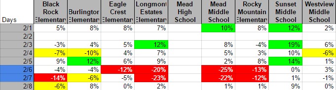
Figure 15: Portfolio of building with daily electricity use compared to weather normalized baselines for both weekdays and weekends.
High intensity systems
One facility expansion identified in the portfolio tracking of the last section was the increase from two to three portable (temporary) classrooms at this elementary school. These modular buildings have packaged electric force air heating which is significantly less efficient than the natural gas hydronic systems of the primary structures. Consequently, even on a seasonally average winter night, those modular buildings which comprise only 8% of the next school area are consuming 17% of the daily kWh usage for the whole school and 37% of the peak load during morning warm-up (as shown in
Figure 16).
Again, it was the building occupants’ shared savings in their conservation program and access to their daily usage data that led them ask the district energy manager to investigate this effect. As opposed to performing a labor intensive and approximate analysis of this electric heating effect it was quite cost effective for that manager to add smaller circuit-level CTs to their existing eGauge monitor and isolate the loads in question. The resulting data has helped district administrators understand the building electrical performance impacts that occur from the use of portable classrooms and start looking at the cost of converting to natural gas heat based on current empirical cost data.
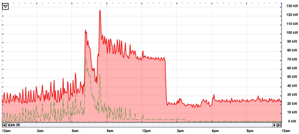
Figure 16: Elementary school with total electricity use in red, and portable classroom electricity use in green.
11) Operations Calendars
Few facilities operate with the same daily schedule loads 365 days a year. Real-time monitoring can help facility managers and portfolio energy managers verify shut-down procedures, building automation exceptions, and unplanned shutdowns like snow days. This allows them to take full advantage of energy charge reductions and potentially capture massive demand charge reductions during month-long vacancies that wholly span monthly billing periods.
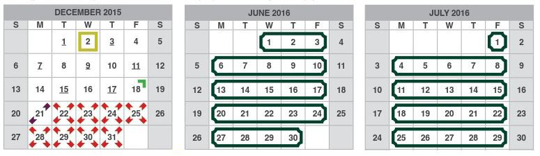
Figure 17: Example of holidays and seasonal closures in a school district.
Summary
In summary, for a facility that expends tens of thousands of dollars a year in electricity costs under demand rates, interval data is a key tool for cost optimization. The quality and ability to openly manipulate that data are key to its utility for energy managers. Magnelab CTs paired with eGauge energy monitors have proven to be cost effective tools for the facility improvements described in this paper.
These case study examples occurred quickly after installation of these monitoring systems. The energy managers using these devices have expanded, or are in the process of expanding their monitored portfolios. The low cost of action on the changes cited in this paper have had immediate returns on investment and savings will grow as these managers fully process the broad collection of data they are now collecting.
Hello Magnelab